In today's digital age, where smartphones and tablets have become an extension of ourselves, it is crucial for businesses to adapt and create a seamless user experience across devices. This is where the art of responsive web design comes into play. Responsive web design is not just about making your website look good on different screen sizes; it is about creating a cohesive and engaging experience for your visitors, regardless of the device they are using. By utilizing fluid grids, flexible images, and media queries, responsive web design ensures that your website adapts and responds to the user's behavior and environment. In this article, we will explore the key principles and techniques behind responsive web design, along with some best practices to help you create a visually stunning and user-friendly website that captivates your audience on any device. So, let's dive into the world of responsive web design and unlock the secrets to creating a seamless digital experience.

Why Responsive Web Design is Important
Gone are the days when people only accessed the internet through their desktop computers. With the rise of smartphones and tablets, users now expect a consistent and enjoyable browsing experience across all devices. This is where responsive web design becomes essential. Responsive web design allows your website to automatically adjust and adapt to different screen sizes, ensuring that your content remains accessible and visually appealing, regardless of the device being used.
One of the main reasons why responsive web design is important is that it improves the overall user experience. When a website is responsive, users don't have to constantly zoom in and out or scroll horizontally to view content. Instead, they can easily navigate through the site, read the text, and interact with the elements without any hassle. This seamless experience not only keeps users engaged but also encourages them to stay longer on your website, explore more pages, and ultimately convert into customers or subscribers.
Another key aspect of responsive web design is its impact on search engine optimization (SEO). Search engines like Google prioritize mobile-friendly websites in their search results. With a responsive website, you have a higher chance of ranking higher in search engine results pages (SERPs) and attracting more organic traffic. Additionally, having a single website that caters to all devices means that you only have to focus on one SEO strategy, making it easier to manage and optimize your website for search engines.
In summary, responsive web design is important because it enhances the user experience, improves SEO, and enables your website to reach a wider audience across multiple devices. By investing in responsive design, you are ensuring that your website remains relevant and competitive in today's mobile-driven world.
The Benefits of Responsive Web Design
Responsive web design offers numerous benefits for both businesses and users. Let's take a closer look at some of the key advantages of implementing responsive design for your website.
- Improved user experience: As mentioned earlier, responsive web design ensures a seamless browsing experience for your users. Whether they are accessing your website on a smartphone, tablet, or desktop computer, they will be able to easily navigate through the site, read the content, and interact with the elements without any issues. This not only keeps users engaged but also encourages them to return to your website in the future.
- Increased mobile traffic: With the exponential growth of mobile usage, having a responsive website is essential to capture the mobile audience. A responsive design allows your website to adapt to different screen sizes, making it accessible to smartphone and tablet users. By catering to the mobile market, you can significantly increase your website's traffic and potential customer base.
- Improved SEO: Search engines like Google prioritize mobile-friendly websites in their search results. By having a responsive website, you improve your chances of ranking higher in search engine results pages (SERPs) and attracting more organic traffic. Additionally, having a single website that caters to all devices means that you only have to focus on one SEO strategy, making it easier to manage and optimize your website for search engines.
- Cost-effective: In the past, businesses used to create separate versions of their websites for different devices. However, with responsive web design, you only need to develop and maintain a single website that works across all devices. This not only saves you time and effort but also reduces costs associated with managing multiple websites.
- Enhanced brand consistency: Brand consistency is crucial for establishing trust and credibility with your audience. With responsive web design, you can ensure that your brand identity, messaging, and visual elements remain consistent across all devices. This creates a cohesive and unified brand experience, which helps to reinforce your brand image and build brand loyalty.
In summary, responsive web design offers a range of benefits, including improved user experience, increased mobile traffic, improved SEO, cost-effectiveness, and enhanced brand consistency. By embracing responsive design, you can stay ahead of the competition and deliver a seamless digital experience to your users, regardless of the device they are using.
Key Principles of Responsive Web Design
To create a truly responsive website, it is important to understand and apply the key principles of responsive web design. These principles serve as guidelines to ensure that your website adapts and responds effectively to different screen sizes and devices. Let's explore some of the key principles that will help you create a responsive design that captivates your audience.
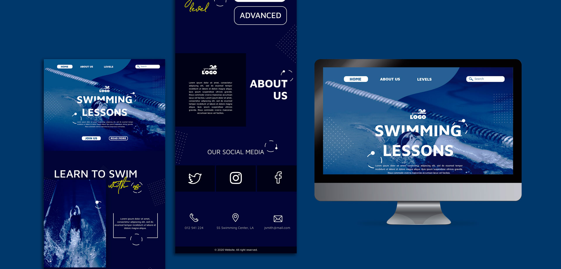
- Fluid Grids: A fluid grid is the foundation of responsive web design. Unlike fixed-width layouts, which have a specific width regardless of the screen size, fluid grids use proportional values to ensure that the layout adjusts and scales according to the device's screen size. This ensures that your website maintains its structure and readability across different devices.
- Flexible Images: Images play a crucial role in web design, but they can also pose challenges when it comes to responsiveness. To ensure that your images don't break the layout or take up too much space on smaller screens, it is important to use flexible images. This can be achieved by setting the maximum width of the image to 100% and using CSS media queries to control the image size and aspect ratio based on the screen size.
- Media Queries: Media queries are CSS techniques that allow you to apply different styles and layouts based on the characteristics of the device or screen size. By using media queries, you can create breakpoints at specific screen sizes and define different CSS rules for each breakpoint. This allows your website to adapt and respond to different devices, providing an optimal viewing experience for users.
- Mobile-First Approach: With the majority of internet users now accessing websites through mobile devices, it is important to adopt a mobile-first approach when designing responsive websites. This means starting the design process by focusing on the mobile experience and then gradually enhancing the design for larger screens. By prioritizing mobile design, you ensure that your website is optimized for the most common and essential devices.
- Progressive Enhancement: Progressive enhancement is a design approach that involves starting with a basic, functional version of the website and then adding more complex features and enhancements for devices with larger screens or more capabilities. This ensures that all users, regardless of their device or browser, can access and use the core functionality of your website. Progressive enhancement also promotes a more inclusive and accessible web experience.
By applying these key principles, you can create a responsive website that adapts and responds effectively to different devices and screen sizes. Remember that responsive web design is an ongoing process, and it requires continuous testing, optimization, and refinement to ensure the best possible user experience.
Techniques for Creating a Responsive Website
Now that we have covered the key principles of responsive web design, let's explore some of the techniques and best practices for creating a responsive website. These techniques will help you implement the principles discussed earlier and ensure that your website looks and functions flawlessly across different devices.
1. Use a Responsive Framework or Grid System
One of the easiest ways to kick-start your responsive web design journey is by using a responsive framework or grid system. These frameworks provide a set of pre-designed components and layouts that are already optimized for responsiveness. By using a responsive framework, you can save time and effort in coding and focus more on customizing the design to fit your brand and content.
Some popular responsive frameworks include Bootstrap, Foundation, and Bulma. These frameworks offer a wide range of responsive components, such as navigation menus, grids, forms, and buttons, that can be easily integrated into your website. Additionally, they provide built-in responsiveness by utilizing fluid grids and CSS media queries.
2. Optimize Images for Different Screen Sizes
Images are an integral part of web design, but they can also impact the performance and responsiveness of your website. To ensure that your images look great and load quickly on all devices, it is essential to optimize them for different screen sizes.
Start by using the appropriate image file format. For photographs and images with complex colors and gradients, use JPEG format. For images with transparency or simple graphics, use PNG format. Additionally, consider compressing your images to reduce file size without compromising quality. Tools like TinyPNG and JPEGmini can help you achieve this.
Another technique is to use responsive image techniques, such as the `srcset` and `sizes` attributes. These attributes allow you to provide different image sources and sizes based on the user's device and screen size. This ensures that the browser only loads the appropriate image based on the user's viewport, resulting in faster load times and better performance.
3. Implement CSS Flexbox and Grid Layouts
CSS Flexbox and Grid layouts are powerful CSS features that enable you to create complex and flexible layouts that respond to different screen sizes. Flexbox provides a one-dimensional layout model, allowing you to distribute and align items along a single axis. Grid layout, on the other hand, provides a two-dimensional layout model, allowing you to create grid-based designs with precise control over rows and columns.
By combining Flexbox and Grid layouts, you can create responsive designs that adapt to various screen sizes and orientations. These layout techniques enable you to easily rearrange and reposition elements, ensuring that your website looks great on both small and large screens.
4. Prioritize Content for Mobile Devices
When designing a responsive website, it is important to prioritize content for mobile devices. Mobile screens have limited space, so you need to carefully consider what content is most important and should be displayed prominently.
Start by identifying the key content and functionality that users need on smaller screens. This could include your main navigation menu, search bar, important headlines, and call-to-action buttons. Make sure these elements are easily accessible and visible without the need for excessive scrolling or zooming.
For larger screens, you can gradually introduce additional content and features. This progressive enhancement approach ensures that your website remains focused on the core content and functionality, regardless of the screen size.
5. Test and Optimize Performance
Responsive web design goes hand in hand with performance optimization. A responsive website should not only look good on all devices but also load quickly and provide a smooth browsing experience.
Start by testing your website's performance using tools like Google PageSpeed Insights or GTmetrix. These tools analyze your website's performance and provide recommendations on how to optimize it. Common performance optimization techniques include minifying CSS and JavaScript files, compressing images, enabling browser caching, and reducing server response time.
In addition to performance optimization, it is important to test your responsive design on different devices and browsers. This ensures that your website looks and functions as intended across various platforms. Use tools like BrowserStack or responsive design testing services to test your website on different devices and screen sizes.
By continuously testing and optimizing your responsive design, you can ensure that your website delivers a fast and seamless browsing experience to all users.
Remember, creating a responsive website is an iterative process. Regularly evaluate and refine your design based on user feedback, analytics data, and emerging trends in mobile and web technology.
Common Mistakes to Avoid in Responsive Web Design
Responsive web design can be a complex and challenging process, especially if you are new to it. Here are some common mistakes to avoid during the responsive design process to ensure that your website looks and functions flawlessly across devices.
1. Ignoring User Experience
Responsive web design is all about creating a seamless user experience across devices. It's important to prioritize user experience throughout the design process and ensure that your website is easy to navigate, read, and interact with on all screen sizes. Avoid overcrowding your design with unnecessary elements or complex navigation menus that can confuse users. Instead, focus on simplicity, clarity, and intuitive user interfaces.
2. Not Testing on Real Devices
While testing your responsive design on emulators and simulators can provide some insights, it is crucial to also test your website on real devices. Emulators and simulators may not always accurately represent how your design will look and function on actual devices. By testing on real devices, you can identify any issues or inconsistencies and make the necessary adjustments to ensure a smooth user experience.
3. Neglecting Performance Optimization
Responsive websites should not only look good on different devices but also load quickly and provide a smooth browsing experience. Neglecting performance optimization can lead to slow-loading pages, high bounce rates, and frustrated users. Make sure to optimize your website's performance by minimizing CSS and JavaScript files, compressing images, and implementing caching techniques.
4. Overlooking Accessibility
Accessibility is an important aspect of web design that should not be overlooked in responsive design. Ensure that your website is accessible to users with disabilities by following accessibility guidelines such as the Web Content Accessibility Guidelines (WCAG). This includes providing alternative text for images, using proper heading structures, and ensuring that your website can be navigated using a keyboard.
5. Not Considering Different Orientations
Responsive web design should not only adapt to different screen sizes but also different device orientations. Users may switch between landscape and portrait modes, and your design should be able to accommodate these changes seamlessly. Make sure to test your design in both orientations to ensure that it remains visually appealing and functional.
Avoiding these common mistakes will help you create a responsive website that provides an exceptional user experience across devices. Remember to continuously test, refine, and optimize your design to ensure the best possible performance and user satisfaction.
Do you want
more traffic?
Book a free 30-minute session to see how we can transform your online presence & grow your brand.